Get Certified in Building Business Dashboards with Power BI & Advanced Excel — enhanced by Copilot + GenAI tools
Get Certified in Building Business Dashboards with Power BI & Advanced Excel — enhanced by Copilot + GenAI tools
For Leaders, Junior managers, Middle or Senior level professionals and stakeholders to leverage Data Visualization for business growth and success | 1 : 1 Mentor Assistance | Certification Exam Assistance
*Based on feedback received from 150+ participants
- 20+ Corporate Dashboards, Power BI Assets discussion & Distribution
- Build Interactive Dashboards
- Solve Business Challenges with Analytics
- 25 hours of Live Sessions
- Real-world Industry Usecases
- Certification Support
- create charts using Gen AI tools
Get Your Brochure
For detailed Brochure, kindly reach us at +91 8123000180 and mail us at programoffice@kpiladder.com
By clicking the button below, you agree to receive communications via Email/Call/WhatsApp/SMS from kpi ladder about this programme and other relevant programmes.
Let's dive into GenAI-Powered Data Visualization and Smart Dashboards
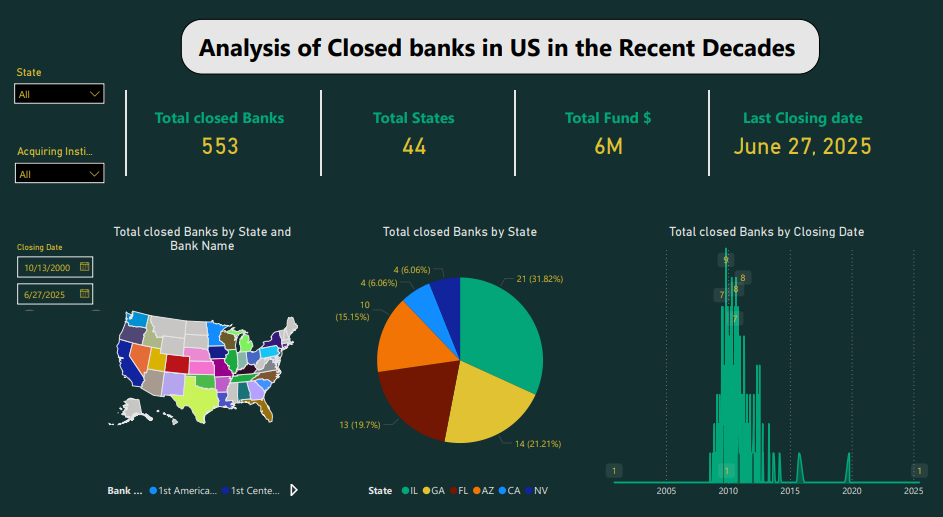
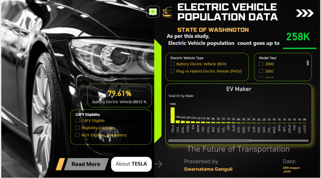
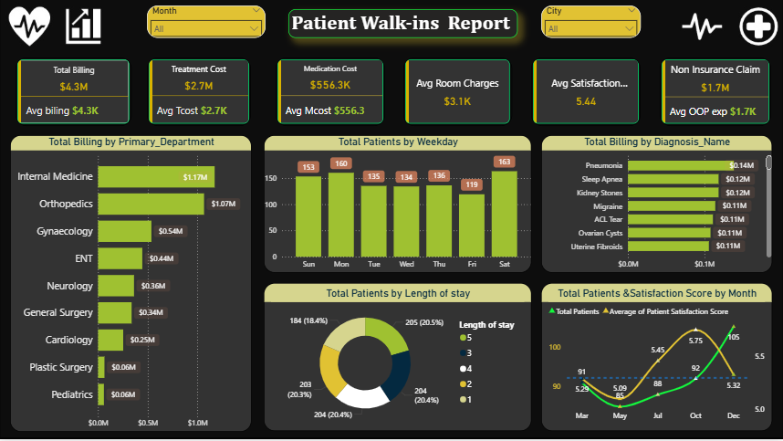
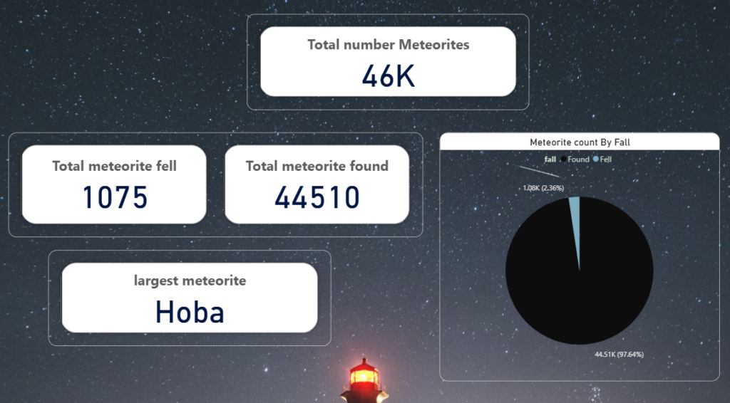
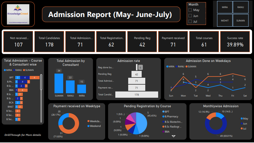
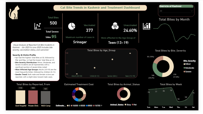
Let’s drive into a learning journey to upskill and gain a competitive edge of Data Analytics. Discussion & distribution of 20+ dashboards & assets from Electric Vehicles, Supply chain, HR , Societal, Banking , Insurance , Project Management, Supply chain, Healthcare & many other areas.
*Limited offer seats available. Claim yours now.
Program Overview
- This 25 hours complete hands-on Power BI & Advanced Excel session is designed to provide immersive, practical learning experiences with elaborative contents and reading materials. The program spans 25 hours, delivered in two parallel batches over 3-4 weeks, focusing on practical industry wise use cases.
- Total Duration: 25 Hours
- Format:1 OR 2 Hours per Day
- Mode – Online
- Advanced Excel (1 Hour/Day for 2 Weeks) – totaling 10 hours of session
- Power BI (1 Hour/Day for 3 Weeks) – totaling 15 hours of session
- Discussion & distribution of 20+ Dashboard PBIX files and Assets
Assessment (1 Hour)- Excel Assessment (30 mins) & Power BI Assessment (30 mins)
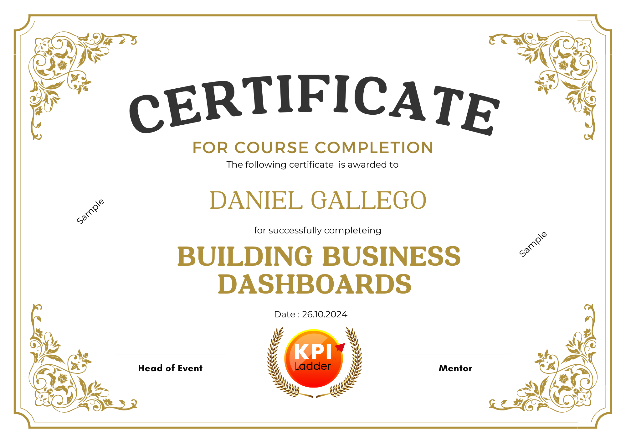
Certificate – Participants will receive a Certificate of Completion from KPI Consulting Services pvt ltd /KPI Ladder
Participants will begin by exploring Power BI as Data Visualization tool and it’s interface and learning how to connect, clean, and transform data from various sources. From Day 1 they will be working on building simple visualizations and data models. By the end of this session, they will be able to create high-end dashboards using key features. The program is focused on learning advanced topics like implementing advanced DAX syntaxes, optimizing data models, and creating interactive, real-time dashboards. Participants will also learn how to create account and publish, share, and embed dashboards in Power BI Service. Learn how to build smart dashboards with GenAI, strengthen your analytics skills, and prepare confidently for Microsoft’s PL-300 certification.
Training Outcome
By the end of this training, participants will be able to:
- Use advanced Excel functions to automate
- Clean and prepare real-world insurance datasets using Excel and Power Query
- Build dynamic summaries and dashboards using PivotTables and conditional formatting
- Design Power BI data models tailored for the insurance domain
- Write and apply DAX for creating calculated KPIs
- Visualize and publish interactive dashboards for stakeholders
- Apply security measures like Row-Level Security for role-based access
- Present performance dashboards to management using Power BI
- Work with Complex Snowflake Schema projects
- PL 300 Certification Assistance with 300+ tentative Sample Qs for practice
**Please note that we are not Microsoft Authorized Training partner and these contents are for educational purpose only
Who is this Programme for?
- Junior or Senior stakeholders, business leaders, and functional leaders seeking to build or grow Data Analytics , Business person, Non coders
- Leaders who want to scale Data Analytics into their organizations and leverage its power for decision-making.
- Professionals in Projects, Healthcare, HR ,Marketing, Finance, and other operational areas who want to understand how Data Analytics or Data Visualisation can enhance their work
- Entrepreneurs, Business Owners, and Consultants seeking to understand AI disruption, capitalize on emerging technologies for new opportunities, aiming to strategically position ventures in the digital age and execute strategies for sustainable growth.
- Researchers seeking to understand projects related to Data Analytics & AI disruption, look for new opportunities
Programme Highlights
25+ Hours of Live and Face-to-Face Learning
Implementing Data Visualization
Data Analytics in to Decision making
Practical case studies & Usecase Discussion
Industry-demand for Digital Leaders
Delivered by Industry’s top 1% Faculty
Projects & Research Assistance
Discussion & distribution of 20+ Dashboard PBIX files and Assets
Programme Modules
- Industry wise real-time Usecase - Advanced topics of Excel , Paste Special, Flash Fill ,Text Functions ,Logical Functions, Conditional Formatting ,Sum IF, SumIFS, Count IF, IFS, IF ERROR, Look Up Functions
- Index Match, Date Functions, Pivot Tables, charts,
- Dashboard, Power Query
- Module 1: Introduction & Data Loading
- Module 2: Data Modeling & Relationships
- Module 3: DAX Essentials
- Module 4: Data Visualization & Storytelling
- Module 5: Advanced Power BI Techniques
- Module 6: Publishing & Sharing
- Bar Chart
- Pie Chart
- Donut Chart
- Line Chart
- Area Chart
- Stacked bar chart
- Gauge Chart
- Ribbon Chart
- Setting the titles of the report
- Putting the logos on the report
- Buttons on the report
- Changing colors and fonts on the report
- Working with Filters - Page Level
- Report Level
- Cross report Filter
- Shaping data using Power Query Editor
- Formatting data , Transformation of data
- Understanding of Data types , Data profiling for data quality check
- Naming conventions & best practices to consider
- Working with Parameters
Merge Query || Append Query
Group by of data (Aggregation of data) - Applied steps (Query settings) , Duplicate & Reference tables
- Transpose of data ,Fill , Pivot & Un-pivot of data
Custom columns Conditional columns - Replace data from the tables || Split columns values
- Move columns & sorting of data
- Detect data type, count rows & reverse rows
- Promote rows as column headers
- Hierarchies in Data Viz
- Formatting and customizing visuals
- Visualization interaction
- Custom visualization
- Top-down and bottom-up analytics & Drill down & Drill through
- Page navigations & Bookmarks
- Selection pane to show/hide visuals
- Comparing volume and value-based analytics
- Combinations charts (dual axis charts)
- Filter pane | Slicers
- Use of Hierarchies in drill down analysis
- Theme for corporate standards & color Aesthetics
- Template for design reusability
Mastering the best practices - Q&A (Natural Language Query visual)
- Sync slicers
Tooltips & custom tooltips - Tables & matrix
Conditional formatting on visuals - Waterfall chart, KPI, Donut chart, Scatter chart, Line charts
Geographical data visualization using Maps - ARGIS Maps , Filled & Shape Maps
- What if analysis - using Parameters
- Key Influencers, Decomposition Tree ,Narrative & Other AI Visuals
- Custom Visuals Heatmaps
- Visual Calc & Customized Card visuals using conditional formatting
- Introduction of relationships, Creating relationships
- Cardinality | Cross filter direction | Use of inactive relationships
- Introduction of DAX | Why DAX is used | DAX syntax | DAX functions
- Context in DAX Calculated columns using DAX
- Measures using DAX
- Calculated tables using DAX
- Related & Related table functions
- Time intelligence functions (YTD, QTD, MTD)
- Cumulative values, calculated tables, and ranking and rank over groups
- Date and time functions
- MAXX & SUMX functions | TOPN functions
- DAX advanced features
Power BI Service & PB Admin & Reusable PB Data Assets
Licensing > workspace > Admin user
Azure cloud Environment View ( Overview )
Entra ID vs Power BI license
Power BI Architecture
Power BI service share datasets/semantic model
Power BI Templates
Endorsement & certification
Data Lineage
Permissions
Sensitivity classification
Row-level security
Column-level security
Direct Query VS Import VS Dual mode
Endorsement Vs Certified semantic model
Performance Analyzer
Power BI Gateways
- Introduction of workspaces
- Reports vs Dashboards
- Building workspace Apps & Sharing reports
- Subscribe, Alerts, Usage statics, Related content
- Design reports & Collaboration
- Scheduling auto data refresh
Discussion - real-time scenarios, Assessment , Usecase discussion
Assessment (1 Hour) Excel Assessment (30 mins) & Power BI Assessment (30 mins)
300+ MCQ or practice test questionnaire
- 1 : 1 Mentor Assistance & Certification Exam Assistance
Mentor Profile
Sheetal Dhingra is a seasoned Learning & Development professional with over 15 years of experience in corporate training, specializing in Advanced Excel and Soft Skills. She has delivered impactful Excel workshops tailored for HR, sales, and admin teams, covering advanced topics like Power Query, Pivot Tables, and Data Analysis. Sheetal is known for her hands-on, practical approach to teaching and has conducted training for diverse audiences across India and the Middle East. As Co-Founder of KPI Ladder, she brings deep domain knowledge, strategic insights, and a passion for enabling skill-based transformation.
Mentor Profile
Swarnatama Ganguli is a Power BI Certified Data Analyst, speaker, and Co-Founder of KPI Ladder with over 17 years of experience in Learning & Development, Business Strategy, and Digital Transformation; he has designed and delivered enterprise-wide analytics and upskilling programs across global IT and non-IT sectors. A passionate advocate for data storytelling and AI integration, Swarnatama hosts insightful podcasts with industry leaders, focusing on innovation, fintech, and the future of work. You can explore his work and insights on LinkedIn and hands-on data projects on GitHub.
Sample Certificate
Esteemed customers who deeply appreciate and support our services


